MACLEAN:THE SPY WHO CAME IN FROM THE COLD
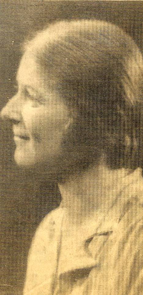
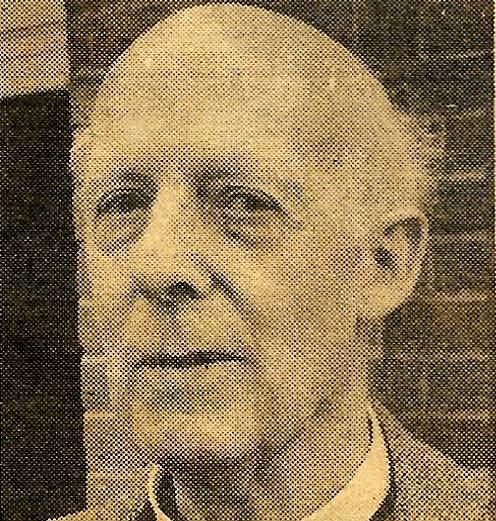 THE VICAR of Penn . who held a torchlight burial service last week at his churchyard for traitor Donald Maclean expects to be criticised for his action.
But the Rev Oscar Muspratt told the Examiner this week that he stood by his decision to provide the final resting place for the notorious spy who defected and died in Russia.
He said: “No priest in the country can just bury the goodies and leave the baddies'” adding that he had taken into account the wishes of the family.
Maclean’s son, Fergus, deliberately gave the Press” the slip to avoid publicity when he brought his father’s ashes into Britain from Moscow last Tuesday.
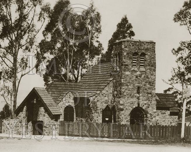
Rapid arrangements were made for a small, simple funeral to begin at 6 pm on the following evening at the family grave with its moss covered Celtic cross next to the 13th century flint church, but heavy traffic had delayed the arrival of Maclean’s brother, Alan, a director of the Macmillan publishing firm, and his wife.
By the time they arrived — Fergus was already present — darkness had begun to fail and Mr Muspratt had to use a battery torch for the service. The verger was also present.
Mr Muspratt denied that anyone had deliberately chosen to hold the funeral in the dark: “We were forced to do so because of the brother and his wife arriving late.”
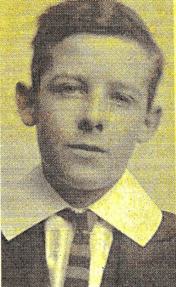
The Vicar said he was aware of bad feelings arising from Maclean’s burial in the country he betrayed. After passing on unknown quantities of top secret information to the Russians, he defected to the USSR in 1951.
Mr Muspratt told the Examiner that he had heard that one local resident had said the burial of Maclean was a desecration of the churchyard, and that the casket containing his ashes should be thrown in a pond.
In a prepared statement. Mr Muspratt contended: “Some would argue that discrimination should be shown in some circumstances, but my reply is only that even on a battlefield, a chaplain buries the fallen, whether friend or foe, with the simple dignity that any death demands.
‘AII alike, great and small, have to stand before the judgement seat of Christ. We should not presume to usurp the role of the Almighty, but rather commend each and everyone to the mercv of God,
“On the merely human level, Donald Maclean certainly paid extremely dearly for his actions. which cost him the loss or all that we treasure most in life.”
Mr Muspratt continued: “One vital point: before I consented to take the burial service, I checked to make sure that no hammer and sickle emblem was emblazoned on the casket: I would have insisted on its removal.”
“I shall always prize the letter of gratitude from his son Fergus in which he expresses his gratitude so movingly and sincerely.”
“My lasting impression is that the Christian faith did indeed have the final say, for in fact it was the message of Christ’s Cross, and not that of the hammer and sickle, which had the last word.”
“This is the heart of the Easter message. not just for the select few, but for all faltering, failing mankind.”
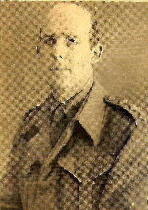 Mr Muspratt returned from duty overseas in the last war as an army chaplain to become the Vicar of Penn 1n 1944.
Although the Vicar cannot recall having met Maclean, he did know the family. Whenever they could, the Macleans would stay at Elm Cottage at Beacon Hill. near to his church, he said.
Mr Muspratt recalls introducing the famous wartime reporter, Chester Wilmot, to the Macleans, who allowed the journalist to write his book, ‘The Struggle for Europe’, at the cottage.
Thirty years ago. the Vicar was asked to conduct a marriage service between Maclean’s sister, Nancy, and a divorcee, but the Bishop of Oxford instructed that only a simplified service could be held at the parish church, The family declined to hold the wedding there.
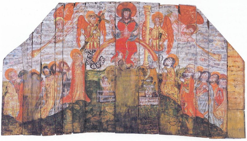
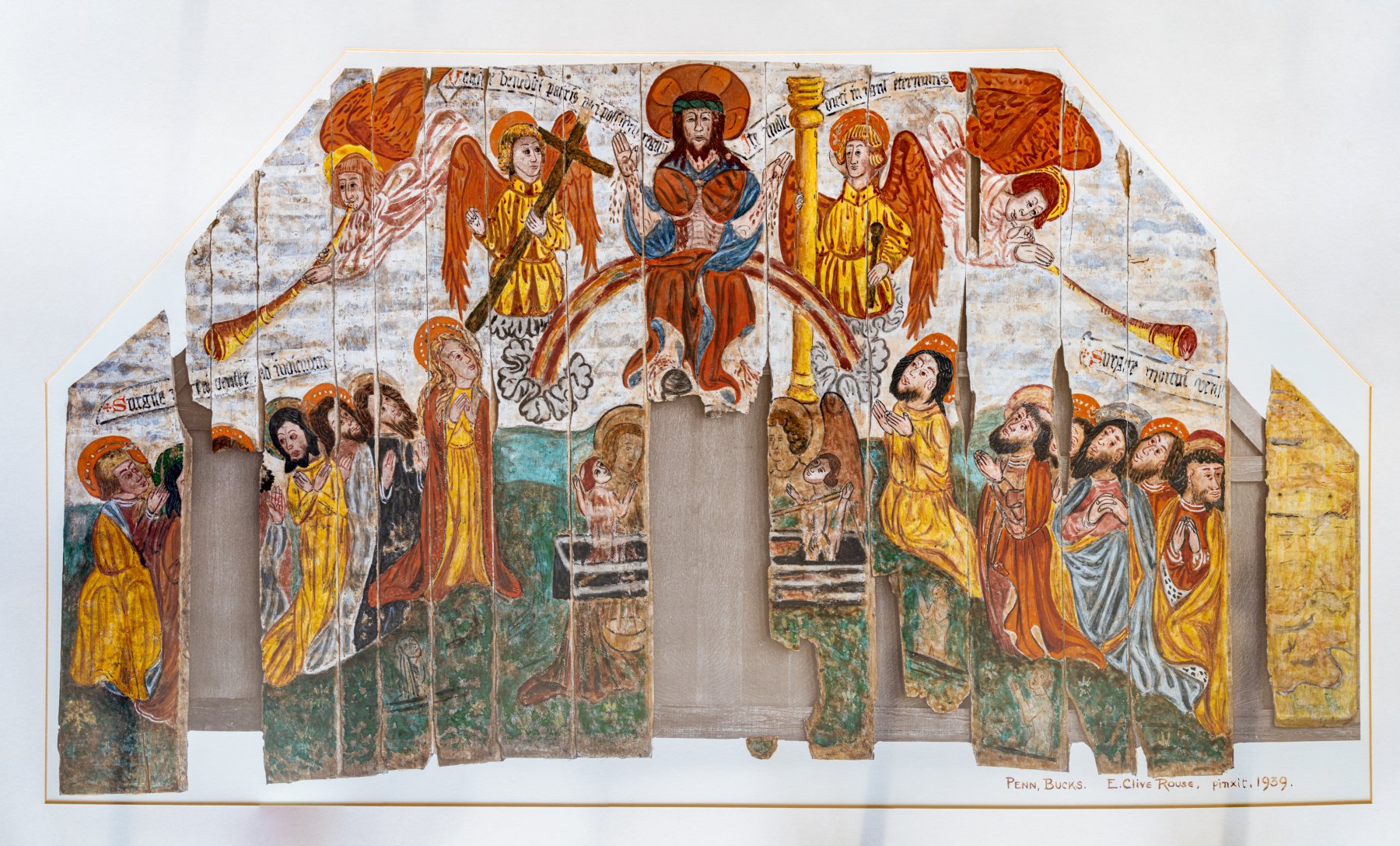
Mr. Muspratt felt that by burying Maclean at the churchyard. he was helping to “redress the balance”. The family grave is also the resting place of his distinguished father, Sir Donald Maclean, a Liberal MP and Minister in the 1931 National Government: his mother, and brother Ian.
Ian Maclean was a pilot during the last war, he was posthumously awarded the Distinguished Flying Cross after being shot down over Denmark in 1942.
Mr. Muspratt remembers that during the funeral of Donald’s mother in 1962 plain clothes police’ officers were in waiting in case the spy should put in a daring secret appearance to pay his last respects.
“When I heard that Maclean had died, my first thought was this is going to put me in a bit of a spot if the ashes were returned for burial at the church, I knew it was highly unlikely that the body would he brought back” the Vicar said.
He said that Fergus wanted the burial service carried out quickly after the ashes were brought into the country to keep it as private as possible. But Alan, said Mr Muspratt, wanted to wait a year “until the dust had settled”.
“I agreed with Fergus, and Alan agreed” Mr Muspratt said. “I was dealing as a Vicar with a family in trouble.”
During his Examiner interview, Mr Muspratt made it clear that in no way did he condone Maclean’s treachery.
Bucks Examiner, March 26 1983, by Ian Paterson..
 “I was always dealing with hardship as a child. It was during those years that I learnt to face danger. And the fearlessness I needed later on in life developed.”